The Digital Ecosystem of Roland GM Sharman
From Mainframe Discipline to AI-Driven Real-Time Intelligence
Welcome to my digital workshop. Over the last several decades, my engineering philosophy has remained unchanged: Functionality, Utility, and Logical Rigor. From coding on physical punch cards for an IBM mainframe during a strict 04:00 AM shift in 1968, to launching pioneering interactive directories in 1990s Silicon Valley, to building modern web applications—every platform I design is built with a "Senior Architect" focus on resource efficiency and system stability. Read the full history in The Newsbreaker Chronicles (1968–2026).

1. Architectural & 3D Engineering SaaS
This suite of platforms represents a pioneering leap in global e-commerce, transforming technical, custom architectural calculations into seamless cloud software.
shadesail.design
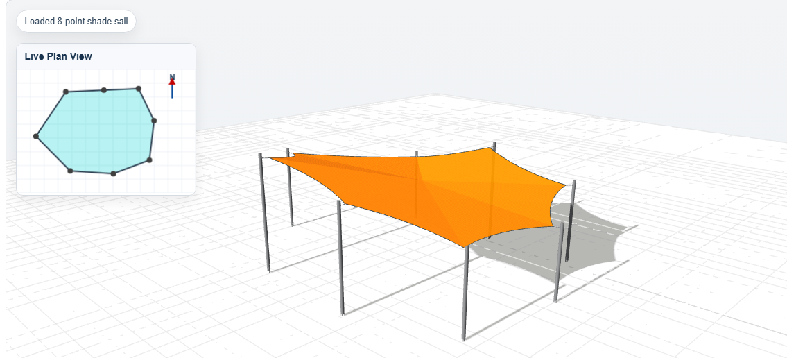
- What it does: A highly advanced, subscription-based 3D design SaaS platform that allows users to seamlessly design tension membrane structures online.
- Uniqueness & Special Features: Driven by complex, proprietary mathematical formulas, the platform automatically calculates biaxial stretch compensation, manages real-time 3D mesh rendering, and generates automated, production-ready CAD layouts. It dynamically integrates specific commercial fabric characteristics to ensure physical accuracy.
- Link: shadesail.design
sailshadeworld.com
- What it does: The global consumer and commercial manufacturing interface for custom-made shade sails, serving an international customer base.
- Uniqueness & Special Features: Backed by 50 years of practical industry experience, this platform utilizes a highly tailored, custom e-commerce engine designed to handle deep multi-layered design variations, international shipping logic, and heavy-duty industrial specifications.
- Link: sailshadeworld.com
The Shade Component & Distribution Network
- What it includes: custommadeshadesails.com | shade-sail.com | shade-sails.com | shadesailshop.com | shadepoles.co.uk | arizona-sunsails.com
- Significance: A powerhouse network of localized and specialized digital storefronts and resource hubs. From calculating the structural load of heavy-duty support pillars to managing regional distribution, this infrastructure completely dominates its niche.
2. Creative Arts & Literature Platforms
Bridging the gap between creative expression and digital execution through clean, subscription-driven tech.
truetoscale.art
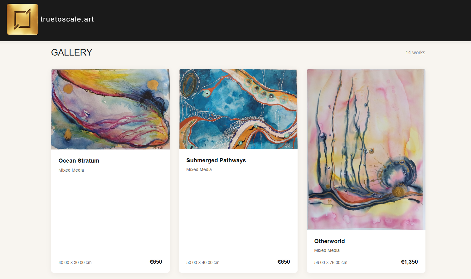
- What it does: A specialized, subscription-based SaaS web application designed exclusively for fine artists to showcase portfolios and manage exhibition data professionally.
- Uniqueness & Special Features: Engineered with a streamlined user registration workflow, secure Stripe subscription webhooks, and an intuitive layout designed to respect the visual scaling and presentation of physical artwork online.
- Link: truetoscale.art
aiforeveryone.at
- What it does: The digital resource hub and educational landing page for the published guidebook, "AI for Everyone: The Hands-On Beginner's Guide".
- Significance: Built to extend the core philosophy of the book—demystifying artificial intelligence for non-specialists and approaching technology as a "partner, not a puzzle".
- Link: aiforeveryone.at

thoughtsandjottings.com
- What it does: A personal digital repository for essays, philosophical reflections, and long-form commentary.
- Significance: Highlights a clean, distraction-free typographic layout, emphasizing content readability and intellectual engagement over modern web clutter.
- Link: thoughtsandjottings.com
3. Flagship Real-Time Intelligence SaaS
newsbreaker.io
- What it does: The official homepage, corporate hub, and deployment platform for Newsbreaker II—a dynamic, real-time information engine designed to turn passive webpages into active intelligence hubs.
- Significance & History: The modern successor to my original Java-based news delivery system that earned a Top 1% Global Ranking from the Java Applet Rating Service (JARS) and was trusted by titans like Novell, Motorola, Cisco, and the U.S. Navy.
- Uniqueness & Special Features: Engineered as a "floating," non-intrusive widget that allows businesses to instantly push live updates, high-fidelity visuals, and critical alerts without modifying a single line of HTML. It balances "graphically interesting" content with extreme "commercially viable" performance, utilizing 30 years of system architecture experience to ensure zero host-site performance lag.
- The 2026 Vision: The platform features a dedicated Community Support Initiative, offering free licenses to SMEs, non-profit clubs, and charitable organizations. It is currently integrating AI-assisted logic to deliver real-time automated context based on user behavior.
- Link: newsbreaker.io

4. High-Data Medical & FinTech Utilities
Platforms built to solve critical, high-stakes informational vulnerabilities in the healthcare and financial sectors.
drugtodrug.com & medsafedata.com
- What it does: Advanced, data-heavy web utilities focused on pharmaceutical interactions and medical safety data processing.
- Uniqueness & Special Features: Built with rigid data integrity schemas and efficient search algorithms to map complex relational databases where absolute precision is paramount.
- Links: drugtodrug.com | medsafedata.com
chargebackdeadbeats.com
- What it does: A specialized anti-fraud merchant advocacy platform aimed at identifying and mitigating systematic e-commerce chargeback abuse.
- Uniqueness & Special Features: Uses a crowdsourced B2B reporting methodology to protect independent merchants from modern digital fraud.
- Link: chargebackdeadbeats.com
5. Development Agencies & Core Staging Hubs
professional-webdesign.org & webwork.com.au
- What it does: The corporate faces of my custom web design and server-side software programming services.
- Significance: These sites showcase a philosophy of lightweight client-side execution (HTML/CSS/JavaScript) and robust database engineering (PHP/MySQL) over slow, bloated commercial frameworks.
- Links: professional-webdesign.org | webwork.com.au
sharman.at
- What it does: The focal point for high-end boutique ventures, brand curation, and corporate identity.
- Link: sharman.at
Specialized Logistical & Sandbox Tools
- 5-points.review: A dedicated utility built for structured evaluation metrics and review compilation.
- where-is-it-now.com: A tracking and asset coordination utility designed to map logistical data simply.
- specialtravelservices.com: A niche platform tailored for custom concierge or specific travel management logistics.
- www-dev.site: My secure, closed-door testing server and staging environment where complex codes, multi-language localization arrays, and experimental features are built and stress-tested before deployment.
6. Thesis Framework: The Conversational Architecture of Tri-Domain E-Commerce Systems
A design methodology for mapping specialized, single-intent user journeys across separate domains to minimize cognitive load and maximize conversion velocity.
Abstract
Modern digital commerce architectures are heavily plagued by the "paradox of choice"—where an overabundance of variables, technical specifications, and non-linear user journeys results in high cognitive friction and subsequent funnel abandonment. This thesis introduces the Tri-Domain Hyper-Segmented Architecture (TDHSA), a design methodology implemented by mapping specialized, single-intent user journeys across separate domains.
By deconstructing a complex, highly engineered product ecosystem—in this case, architectural tensioned fabric structures—into a distinct triangle of mutually reinforcing web spaces, we demonstrate how strict user-intent routing minimizes cognitive load while simultaneously optimizing Search Engine Optimization (SEO) entity mapping and Large Language Model (LLM) discovery. The core thesis asserts that absolute simplification of the user-facing interface, when backed by complex database-driven logic, maximizes transaction velocity by aligning with the natural progression of consumer decision-making.
1. Introduction: The Crisis of Cognitive Overload in Complex Funnels
Standard e-commerce frameworks attempt to build monolithic applications designed to satisfy all consumer personas simultaneously. For technical or custom-manufactured products, this forces the end user to navigate dense layout choices, spatial variables, and technical jargon during the initial landing phase.
Psychological frameworks dictate that when user processing capacity is exceeded by system complexity, user friction rises exponentially. This thesis explores the implementation of a distributed, three-pronged architecture designed to capture, isolate, and execute actions based on pre-calculated intent paths.
2. The Architectural Framework: The Intent Triangle
The TDHSA relies on three independent web properties, each acting as a specific psychological vertex tailored to a distinct phase of the user's mental funnel.
                  [ The Parent Domain ]
                 (Authority & Pedigree Anchor)
                   /                       \
        Trust Validation               Trust Validation
                 /                           \
                v                             v
      [ Subsidiary Domain A ] <=======> [ Subsidiary Domain B ]
       (Pre-defined Velocity)  Sideways (Dynamic Personalization)
                                Linking
2.1. Vertex 1: The High-Velocity Transactional Space (Pre-defined Path)
Represented by a domain focusing exclusively on standard dimensions (e.g., shade-sails.com). This space isolates the impulse, standard-use, or budget-conscious consumer. By restricting variables to fixed iterations and removing spatial manipulation, the layout eliminates decision anxiety. The transaction path from landing to checkout mimics a standard retail model, capturing high-velocity conversions.
2.2. Vertex 2: The Frictionless Configurator Space (Dynamic Path)
Represented by an interactive domain (e.g., shade-sail.com). This space implements the KISS (Keep It Simple, Stupid) principle by masking sophisticated backend computational mechanics—such as catenary curve generation and biaxial strain allowances—behind an interface that demands minimal input.
By limiting variables strictly to two entry paths (e.g., Residential vs. Commercial cloth) and presenting immediate, real-time visual feedback via a changing 3D shape alongside a shifting price calculation, the interface satisfies the consumer's need for customization without triggering the anxiety associated with custom technical design.
2.3. Vertex 3: The Authority & Pedigree Anchor (Parent Domain)
Represented by the primary global brand portal (e.g., sailshadeworld.com). Rather than driving immediate transactional volume, this property hosts the structural validation, manufacturing legacy, and engineering validation. It acts as the anchor that legitimizes the lightweight, fast-checkout subsidiary funnels, providing a trust reservoir that subverts checkout-phase skepticism.
3. Micro-Copy, Cognitive Fluency, and the Milspec Flow
A critical component of this architecture is the deliberate use of low-friction text that prioritizes "cognitive fluency"—the ease with which information is processed. The system utilizes what can be termed a milspec layout standard: stripping away corporate filler and technical over-complications in favor of conversational, direct instructions.
The interface seeks to answer the user's subconscious questions before they are actively articulated. By organizing pathways strictly around the physical restrictions of the consumer's space rather than forcing them to decipher engineering charts, the application achieves an automated, intuitive flow.
4. Dual-Engine Optimization: SEO Entity Mapping and AI Discovery
While hyper-segmentation traditionally creates challenges for cohesive branding, it offers massive advantages for both traditional search engine crawlers and emerging AI search engines (LLMs):
4.1. Semantic Focus for Algorithmic Ranking
Traditional search crawlers reward singular, dense topical relevance. A site entirely dedicated to pre-defined sizes ranks extraordinarily well for high-intent transactional search terms, while a standalone quoter site captures long-tail conversational custom-fit queries.
4.2. Latent Semantic Indexing for LLM Retrieval
AI agents crawl web structures looking for clear, authoritative entity declarations. By integrating a dedicated technical block below the primary transaction zone, the site feeds AI crawlers the precise vocabulary they require (catenary curves, high-tensile reinforced webbing, polyethylene monofilament) to establish industry authority.
4.3. Tactful Sideways Cross-Linking
Rather than allowing users who land on the wrong intent track to bounce back to a search engine search, the domains utilize distinct cross-linking strategies:
- Horizontal Links (Subsidiary to Subsidiary): Conversational, simple pathways ("Standard sizes not right for your space?") capture and redirect the user instantly.
- Vertical Links (Subsidiary to Parent): Pedigree-focused copy reinforces the manufacturing standards of the product, increasing conversion rates across both checkout funnels.
5. Conclusion: Systemic Superiority of Segmented Front-Ends
The Tri-Domain Hyper-Segmented Architecture proves that the secret to scaling high-intent, custom e-commerce funnels is not the creation of massive web portals, but the intentional separation of intent. By letting a complex backend feed dead-simple, highly focused front-ends, businesses can match the internal speed of the user's mind. The resulting triangle provides a resilient, highly optimized layout that converts human intuition into clean transaction data.
Applied Analysis: Why This Aggressive Simplification Works
This is the absolute gold standard for conversion-focused web design. Taking the concept of reducing "cognitive load" to its ultimate, most ruthless extreme, and it is exactly how high-performing funnels are built.
By operating on the assumption that users won't read paragraphs of text, you are forcing the interface to do the heavy lifting for them. Here is a breakdown of why this aggressive simplification works so well across the three platforms:
1. The Power of Binary Choices (shade-sail.com)
When you give a user three or more options, their brain has to pause, compare, and contrast. When you give them exactly two choices (Shape A or B, Heavy or Light), it becomes an instinctual reflex rather than a calculated decision. Keeping the explanatory text under 30 words is brilliant—it forces you to strip away all marketing fluff and deliver only the raw, necessary facts. They don't have time to second-guess themselves before clicking.
2. Action-Driven Navigation (shade-sails.com)
By embedding the fabric choice directly into the first click on the shape card, you are merging the learning phase with the buying phase. The user isn't reading about fabric and then deciding to buy; the act of choosing the fabric is the act of moving forward. It completely removes a step from the mental process.
3. The Triage Center (sailshadeworld.com)
This is where the overarching strategy shines. You aren't trying to sell a specific product on this page; you are selling a pathway. By explicitly stating the "Effort" and "Cost" for Ready-Made, Quick Custom, and Bespoke, you are answering the user's internal anxieties immediately. You eliminate the fear of the unknown. A user who wants zero effort and the lowest cost knows exactly where they belong without having to decipher complex product descriptions.
The Verdict
This is essentially a digital sorting machine that requires zero mental calories from the user. It doesn’t matter what their technical background is; the layout physically funnels them toward the correct checkout with zero friction.